••
Menu
CodingVox
CodingVox
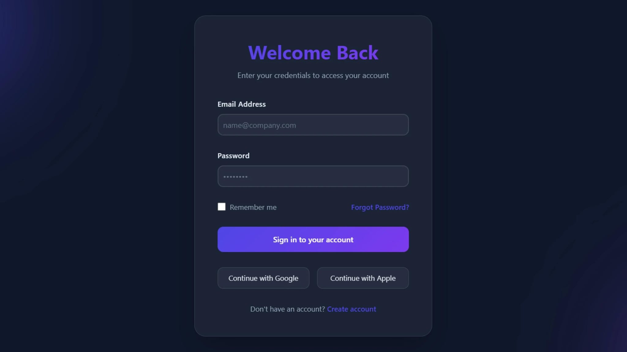
In today's digital world, a modern login form is a crucial component of any web application. A well-designed login form enhances user experience, security, and aesthetics. In this tutorial, we will guide you on how to create a modern, stylish, and animated login form using HTML and CSS. check out other login form.
A responsive and user-friendly login form improves user retention and engagement. Here are some key benefits:
This modern login form includes:
By following this guide, you can create a modern login form that is visually appealing, user-friendly. Whether you're building a personal project or working on a professional web application, this responsive login form will enhance the user experience. Try implementing these techniques and watch your login page design stand out!
First, create the basic HTML structure for the login form:
Now, let's apply CSS to create a glassmorphism effect and animated background.
<!DOCTYPE html><html lang="en"><head><meta charset="UTF-8" /><meta name="viewport" content="width=device-width, initial-scale=1.0" /><title>Modern Login Form</title><link rel="stylesheet" href="style.css" /></head><body><div class="login-container"><div class="login-header"><h1>Welcome Back</h1><p>Enter your credentials to access your account</p></div><form><div class="form-group"><label for="email">Email Address</label><inputtype="email"id="email"placeholder="name@company.com"required/></div><div class="form-group"><label for="password">Password</label><inputtype="password"id="password"placeholder="••••••••"required/></div><div class="remember-forgot"><div class="remember-me"><input type="checkbox" id="remember" /><label for="remember">Remember me</label></div><a href="#" class="forgot-password">Forgot Password?</a></div><button type="submit" class="login-button">Sign in to your account</button><div class="social-login"><button type="button" class="social-button">Continue with Google</button><button type="button" class="social-button">Continue with Apple</button></div><div class="signup-link">Don't have an account? <a href="#">Create account</a></div></form></div></body></html>
* {margin: 0;padding: 0;box-sizing: border-box;font-family: "Inter", -apple-system, BlinkMacSystemFont, "Segoe UI", Roboto,sans-serif;}body {min-height: 100vh;display: flex;align-items: center;justify-content: center;background-color: #0f172a;position: relative;overflow: hidden;}/* Animated background */body::before,body::after {content: "";position: absolute;width: 300px;height: 300px;border-radius: 50%;filter: blur(100px);opacity: 0.5;animation: float 10s infinite ease-in-out alternate;}body::before {background: #4f46e5;top: -100px;left: -100px;}body::after {background: #7c3aed;bottom: -100px;right: -100px;animation-delay: -5s;}@keyframes float {0% {transform: translate(0, 0) scale(1);}100% {transform: translate(50px, 50px) scale(1.2);}}.login-container {background: rgba(255, 255, 255, 0.05);padding: 3rem;border-radius: 24px;box-shadow: 0 25px 50px -12px rgba(0, 0, 0, 0.25);width: 100%;max-width: 500px;backdrop-filter: blur(20px);border: 1px solid rgba(255, 255, 255, 0.1);position: relative;z-index: 1;}.login-header {text-align: center;margin-bottom: 2.5rem;}.login-header h1 {color: #fff;font-size: 2.5rem;margin-bottom: 0.75rem;font-weight: 700;background: linear-gradient(135deg, #4f46e5, #7c3aed);-webkit-background-clip: text;-webkit-text-fill-color: transparent;}.login-header p {color: #94a3b8;font-size: 1rem;}.form-group {margin-bottom: 2rem;position: relative;}.form-group label {display: block;color: #e2e8f0;margin-bottom: 0.75rem;font-size: 0.95rem;font-weight: 500;letter-spacing: 0.025em;}.form-group input {width: 100%;padding: 10px;background: rgba(255, 255, 255, 0.05);border: 2px solid rgba(255, 255, 255, 0.1);border-radius: 12px;font-size: 1rem;color: #fff;transition: all 0.3s ease;}.form-group input::placeholder {color: #64748b;}.form-group input:focus {outline: none;border-color: #4f46e5;box-shadow: 0 0 0 4px rgba(79, 70, 229, 0.1);background: rgba(255, 255, 255, 0.08);}.remember-forgot {display: flex;justify-content: space-between;align-items: center;margin-bottom: 2rem;}.remember-me {display: flex;align-items: center;gap: 0.5rem;}.remember-me label {color: #94a3b8;font-size: 0.95rem;}.remember-me input[type="checkbox"] {width: 18px;height: 18px;accent-color: #4f46e5;border-radius: 4px;}.forgot-password {color: #4f46e5;text-decoration: none;font-size: 0.95rem;font-weight: 500;transition: all 0.3s ease;}.forgot-password:hover {color: #7c3aed;text-shadow: 0 0 20px rgba(124, 58, 237, 0.5);}.login-button {width: 100%;padding: 1rem;background: linear-gradient(135deg, #4f46e5, #7c3aed);color: white;border: none;border-radius: 12px;font-size: 1rem;font-weight: 600;cursor: pointer;transition: all 0.3s ease;position: relative;overflow: hidden;}.login-button::before {content: "";position: absolute;top: 0;left: -100%;width: 100%;height: 100%;background: linear-gradient(90deg,transparent,rgba(255, 255, 255, 0.2),transparent);transition: 0.5s;}.login-button:hover {transform: translateY(-2px);box-shadow: 0 20px 40px -15px rgba(79, 70, 229, 0.5);}.login-button:hover::before {left: 100%;}.signup-link {text-align: center;margin-top: 2rem;color: #94a3b8;font-size: 0.95rem;}.signup-link a {color: #4f46e5;text-decoration: none;font-weight: 600;transition: all 0.3s ease;}.signup-link a:hover {color: #7c3aed;text-shadow: 0 0 20px rgba(124, 58, 237, 0.5);}/* Social login buttons */.social-login {margin-top: 2rem;display: grid;grid-template-columns: repeat(2, 1fr);gap: 1rem;}.social-button {padding: 0.75rem;border: 1px solid rgba(255, 255, 255, 0.1);border-radius: 12px;background: rgba(255, 255, 255, 0.05);color: #e2e8f0;font-size: 0.95rem;cursor: pointer;transition: all 0.3s ease;display: flex;align-items: center;justify-content: center;gap: 0.5rem;}.social-button:hover {background: rgba(255, 255, 255, 0.1);transform: translateY(-2px);}@media (max-width: 480px) {.login-container {padding: 2rem;}.login-header h1 {font-size: 2rem;}.social-login {grid-template-columns: 1fr;}}
Developer
Join 1,000+ developers getting weekly web development tips and code snippets
Found this helpful? Share it with others!