••
Menu
CodingVox
CodingVox
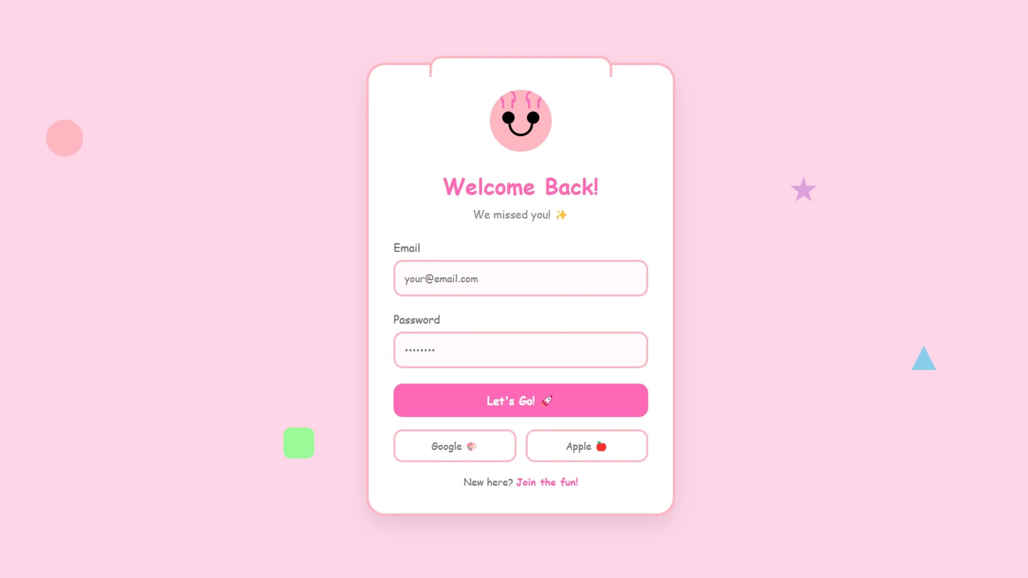
A login form doesn’t have to be boring! This tutorial walks you through building a cartoon-themed login form that’s fun, interactive, and visually engaging. Using HTML, CSS, and JavaScript, we’ll create a login page where an animated character reacts to user input. Check out our other login form.
Adding playful elements to a login form can:
This cartoon-themed login form transforms a standard login experience into something fun and engaging. With animated elements, interactive UI, and a vibrant aesthetic, it stands out from traditional login designs. Try implementing this playful approach in your web projects today!
<!DOCTYPE html><html lang="en"><head><meta charset="UTF-8" /><meta name="viewport" content="width=device-width, initial-scale=1.0" /><title>Cartoon Login Form</title><link rel="stylesheet" href="style.css" /></head><body><div class="floating-shapes"><div class="shape shape1"></div><div class="shape shape2"></div><div class="shape shape3"></div><div class="shape shape4"></div></div><div class="login-container"><div class="character"><div class="hands"><div class="hand"></div><div class="hand"></div></div><div class="eyes"><div class="eye"></div><div class="eye"></div></div><div class="mouth"></div></div><h1>Welcome Back!</h1><p>We missed you! ✨</p><form><div class="input-group"><label for="email">Email</label><inputtype="email"id="email"placeholder="your@email.com"required/></div><div class="input-group"><label for="password">Password</label><inputtype="password"id="password"placeholder="••••••••"required/></div><button type="submit" class="login-button">Let's Go! 🚀</button><div class="social-login"><button type="button" class="social-button">Google 🎨</button><button type="button" class="social-button">Apple 🍎</button></div><div class="signup-link">New here? <a href="#">Join the fun!</a></div></form></div><script>const passwordInput = document.getElementById("password");const character = document.querySelector(".character");passwordInput.addEventListener("focus", () => {character.classList.add("hiding");});passwordInput.addEventListener("blur", () => {character.classList.remove("hiding");});</script></body></html>
* {margin: 0;padding: 0;box-sizing: border-box;font-family: "Fredoka", "Comic Sans MS", cursive;}body {min-height: 100vh;display: flex;align-items: center;justify-content: center;background: #ffd6e8;padding: 20px;position: relative;}/* Floating Shapes Animation */.floating-shapes {position: fixed;width: 100%;height: 100%;top: 0;left: 0;z-index: 0;pointer-events: none;}.shape {position: absolute;animation: float 15s infinite linear;}.shape1 {width: 60px;height: 60px;background: #ffb6c1;border-radius: 50%;top: 20%;left: 10%;animation-delay: -2s;}.shape2 {width: 40px;height: 40px;background: #87ceeb;clip-path: polygon(50% 0%, 0% 100%, 100% 100%);top: 60%;right: 15%;animation-delay: -4s;}.shape3 {width: 50px;height: 50px;background: #98fb98;border-radius: 12px;bottom: 20%;left: 30%;animation-delay: -6s;}.shape4 {width: 45px;height: 45px;background: #dda0dd;clip-path: polygon(50% 0%,61% 35%,98% 35%,68% 57%,79% 91%,50% 70%,21% 91%,32% 57%,2% 35%,39% 35%);top: 30%;right: 25%;animation-delay: -8s;}@keyframes float {0% {transform: translate(0, 0) rotate(0deg);}25% {transform: translate(100px, 50px) rotate(90deg);}50% {transform: translate(50px, 100px) rotate(180deg);}75% {transform: translate(-50px, 50px) rotate(270deg);}100% {transform: translate(0, 0) rotate(360deg);}}.login-container {position: relative;z-index: 1;background: white;padding: 40px;border-radius: 30px;box-shadow: 0 15px 35px rgba(0, 0, 0, 0.1);width: 100%;max-width: 500px;border: 4px solid #ffb6c1;}.login-container::before {content: "";position: absolute;top: -15px;left: 20%;right: 20%;height: 30px;background: white;border: 4px solid #ffb6c1;border-bottom: none;border-radius: 20px 20px 0 0;z-index: -1;}.character {width: 100px;height: 100px;background: #ffb6c1;border-radius: 50%;margin: 0 auto 30px;position: relative;overflow: hidden;}.eyes {position: absolute;top: 35%;width: 100%;display: flex;justify-content: space-evenly;}.eye {width: 20px;height: 20px;background: black;border-radius: 50%;position: relative;animation: blink 4s infinite;transition: all 0.3s ease;}/* Hands covering eyes */.hands {position: absolute;top: 25%;width: 100%;display: flex;justify-content: space-evenly;transform: translateY(-100%);transition: all 0.3s ease;pointer-events: none;}.hand {width: 25px;height: 25px;background: #ffb6c1;border: 3px solid #ff69b4;border-radius: 50%;position: relative;}.hand::after {content: "";position: absolute;bottom: -8px;left: 50%;transform: translateX(-50%);width: 12px;height: 15px;background: #ffb6c1;border-left: 3px solid #ff69b4;border-right: 3px solid #ff69b4;}.character.hiding .hands {transform: translateY(0);}.character.hiding .eye {height: 2px;background: #666;margin-top: 9px;}@keyframes blink {0%,96%,98% {transform: scaleY(1);}97% {transform: scaleY(0.1);}}.mouth {position: absolute;bottom: 25%;left: 50%;transform: translateX(-50%);width: 40px;height: 20px;border: 4px solid black;border-radius: 0 0 20px 20px;border-top: 0;transition: all 0.3s ease;}.character.hiding .mouth {height: 25px;border-radius: 20px 20px 20px 20px;border-top: 4px solid black;}h1 {text-align: center;color: #ff69b4;font-size: 2.2rem;margin-bottom: 10px;}p {text-align: center;color: #888;margin-bottom: 30px;font-size: 1.1rem;}.input-group {margin-bottom: 25px;position: relative;}.input-group label {display: block;margin-bottom: 8px;color: #666;font-size: 1.1rem;}.input-group input {width: 100%;padding: 15px;border: 3px solid #ffb6c1;border-radius: 15px;font-size: 1rem;transition: all 0.3s ease;background: #fff9fb;}.input-group input:focus {outline: none;border-color: #ff69b4;box-shadow: 0 0 10px rgba(255, 182, 193, 0.3);}.login-button {width: 100%;padding: 15px;border: none;border-radius: 15px;background: #ff69b4;color: white;font-size: 1.1rem;font-weight: bold;cursor: pointer;transition: transform 0.3s ease;margin-bottom: 20px;}.login-button:hover {transform: scale(1.02) translateY(-2px);background: #ff1493;}.login-button:active {transform: scale(0.98);}.social-login {display: flex;gap: 15px;margin-bottom: 20px;}.social-button {flex: 1;padding: 12px;border: 3px solid #ffb6c1;border-radius: 15px;background: white;color: #666;font-size: 1rem;cursor: pointer;transition: all 0.3s ease;}.social-button:hover {background: #fff9fb;transform: translateY(-2px);}.signup-link {text-align: center;color: #666;}.signup-link a {color: #ff69b4;text-decoration: none;font-weight: bold;}.signup-link a:hover {color: #ff1493;text-decoration: underline;}@media (max-width: 480px) {.login-container {padding: 30px 20px;}h1 {font-size: 1.8rem;}.character {width: 80px;height: 80px;}}
Developer
Join 1,000+ developers getting weekly web development tips and code snippets
Found this helpful? Share it with others!